HOME/BLOG/I DREW FONT STICKERS BY HAND IN 1998. NOW AI SKETCHNOTES ARE A THING.
AI Tools
I Drew Font Stickers by Hand in 1998. Now AI Sketchnotes Are a Thing.
My Exact AI Sketchnote Workflow (Step by Step)
July 2, 2026|5 min read
I found a hand-lettered piece in a notebook yesterday that I completely forgot existed.
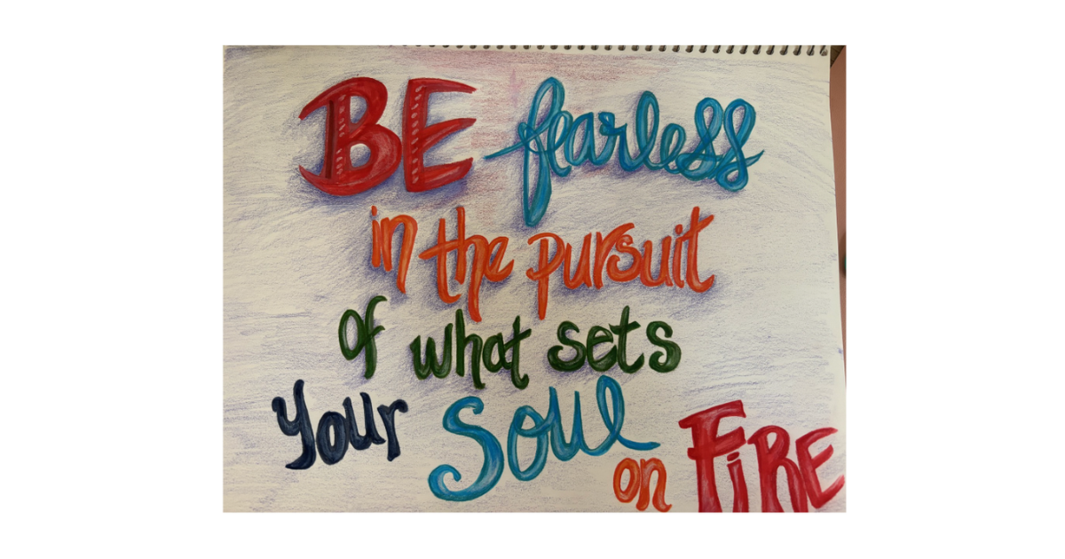
"Be Fearless in the pursuit of what sets your Soul on Fire." Four different lettering styles, multiple colors, each word in a different weight. I made it years ago, just playing around, the way I've always played around with pens, markers, and paper.
A notebook page I made years ago and completely forgot about. Four lettering styles, multiple colors, pure instinct.
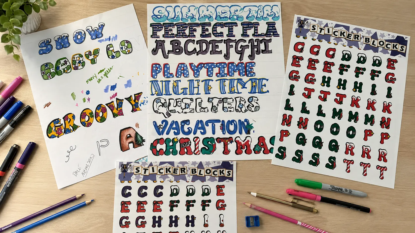
I've been this way my whole life. When I was a senior in high school, I was a class officer: Senior Class Publicity (I got to make all the posters, flyers, etc.; it was a good gig, lol). Then when I owned my scrapbook store back in 1998, I hand-drew entire themed alphabets... Snow, Groovy, Christmas, Quilters, Nighttime, Catch A Wave. Each letter had its own illustrations inside the letterforms. Snowflakes inside the Snow font. Flowers and polka dots inside Baby Love. A company called Pixie Press turned them into commercial sticker sheets and sold them.
The originals and the finished product. I hand-drew every font, and Pixie Press turned them into commercial sticker sheets.
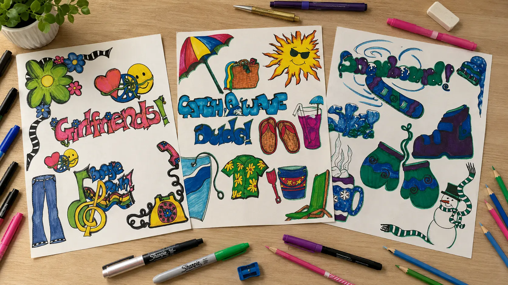
But it didn't stop at fonts. I designed full-themed illustration collections, too... a Girlfriends sheet with peace signs, bell bottoms, and rotary phones. A Catch A Wave beach set. A Snowboard winter collection with mittens and hot cocoa. All hand-drawn, all produced commercially by Pixie Press around 2000. I taught lettering classes in my shop. Doodling, sketching, and visual design have always been part of how my brain works.
Three of my original themed illustration collections, all hand-drawn for Pixie Press around 2000.
I just never had a name for the visual note-taking side of it.
Turns out, the name is sketchnoting. And AI sketchnotes are now something you can create in your brand colors, in under five minutes, without picking up a Micron pen... unless you want to. (These days I'd rather spend that time painting watercolors.)
Here's what I'm making now, the workflow behind it, and everything you need to start making your own.
What Are Sketchnotes (And Where Did They Come From)?
Sketchnotes are visual notes that combine hand-lettering, simple doodle icons, and loose structure to capture ideas in a way that actually sticks. The term comes from Mike Rohde, a designer who wrote The Sketchnote Handbook back in 2012 and basically gave a name and a framework to something visual thinkers had been doing forever.
His core idea is that the job isn't to write everything down... it's to capture the important things.
That's the whole concept. Sketchnotes aren't art. They're thinking made visible. Different lettering weights for different levels of importance. Simple icons instead of paragraphs. Arrows and paths that show how ideas connect. The imperfection is the point... It's supposed to look like someone worked through the idea in real time, not like it was designed in Canva.
If you've ever doodled in the margins of a notebook during a meeting and walked away remembering more than the person who typed everything out... you already understand why this works. Words plus images together create stronger memory than either one alone. There's actual cognitive research behind it (dual coding theory, if you want to look it up), but you don't need the research to know it's true. You've experienced it.
What Makes AI Sketchnotes Work for Social Media?
AI sketchnotes stop the scroll because they look hand-drawn in a feed full of polished graphics and templated quote cards. That visual contrast is a genuine pattern interrupt... people stop because it registers differently than another AI-generated photo or another branded carousel.
I love my Pixar-style graphics. They're a core part of my brand at this point. But when you love the visual side of content, it's easy to get a little bored. AI sketchnotes gave me a second visual language that feels completely different but stays on-brand because I'm using the same color palette across both.
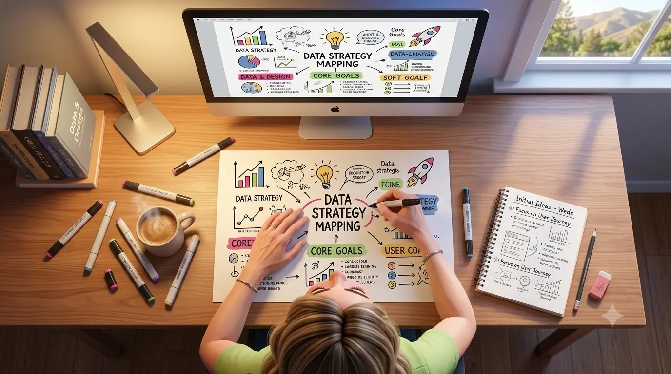
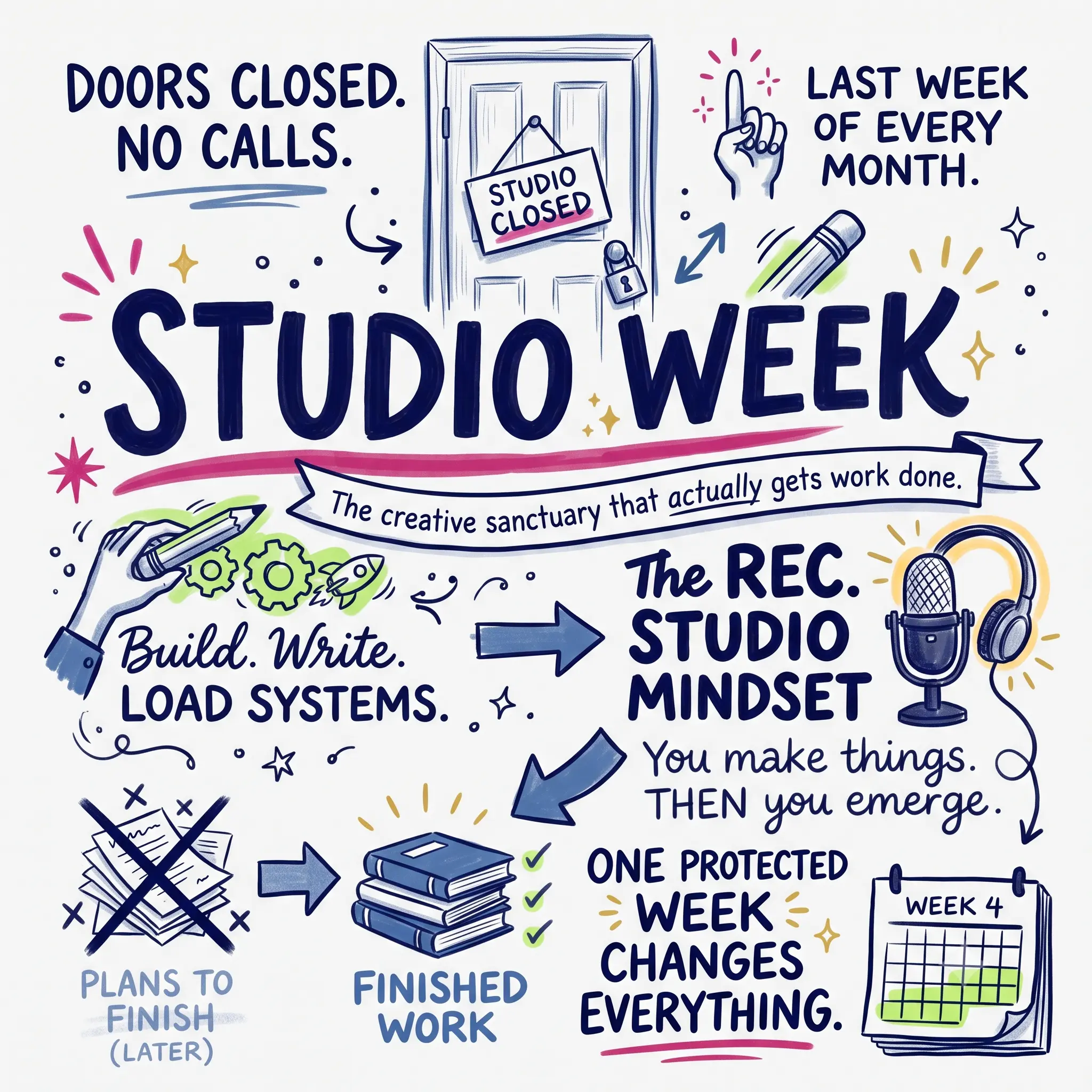
They also teach without being a wall of text. One sketchnote can communicate what would take a 500-word caption to explain, and people actually engage with it. I posted a Studio Week sketchnote on Substack Notes, and the response was immediate... people saved it, shared it, asked how I made it.
My Studio Week concept as an AI sketchnote. This is the one that started it all.
Beyond social posts, I'm using them as video openers, video chapter titles, Substack Note visuals, and I'm in the process of using Remotion in Claude Code to generate sketchnote videos! I'll probably have to do a separate post on the videos. The format just keeps giving. 😉
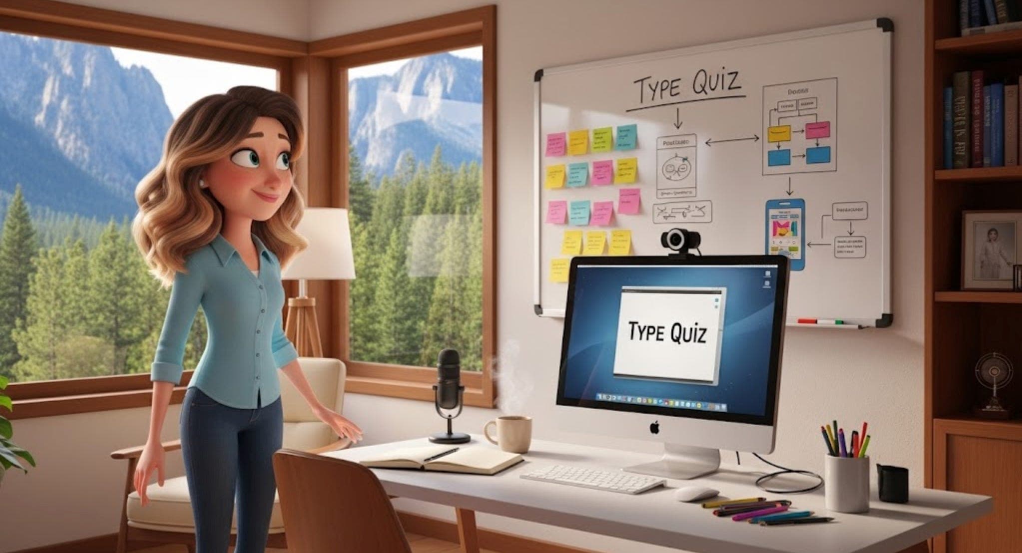
My Exact AI Sketchnote Workflow (Step by Step)
Here's exactly how I create AI sketchnotes. It's simpler than you'd think.
The foundation: two custom Gemini Gems. One generates square sketchnotes (1080x1080, for Substack Notes and Instagram), and the other generates vertical sketchnotes (1080x1920, for Stories and Reels). The Gem holds all my brand rules... the exact hex values for my colors, the hand-drawn style instructions, the typography hierarchy, the layout preferences. Once the Gem is set up, every prompt starts from the right foundation, without me having to re-explain everything.
The process:
Step 1: Pick the concept. What's the one idea? An offer ladder, a workflow, a set of principles, a process. One concept per sketchnote. If I'm trying to cram in more than 4-6 elements, it's too much.
Step 2: Write the prompt. Not "make me a sketchnote about my business." A real prompt. I tell it the layout I want (ascending path, top-down flow, scattered cluster... be specific), what each element should look like as a doodle, where the brand colors go, and what the labels should say.
Step 3: Generate in the Gem. Then look at what comes back.
Step 4: Iterate. This is where most people give up too early. The first result is the starting point, not the finish line.
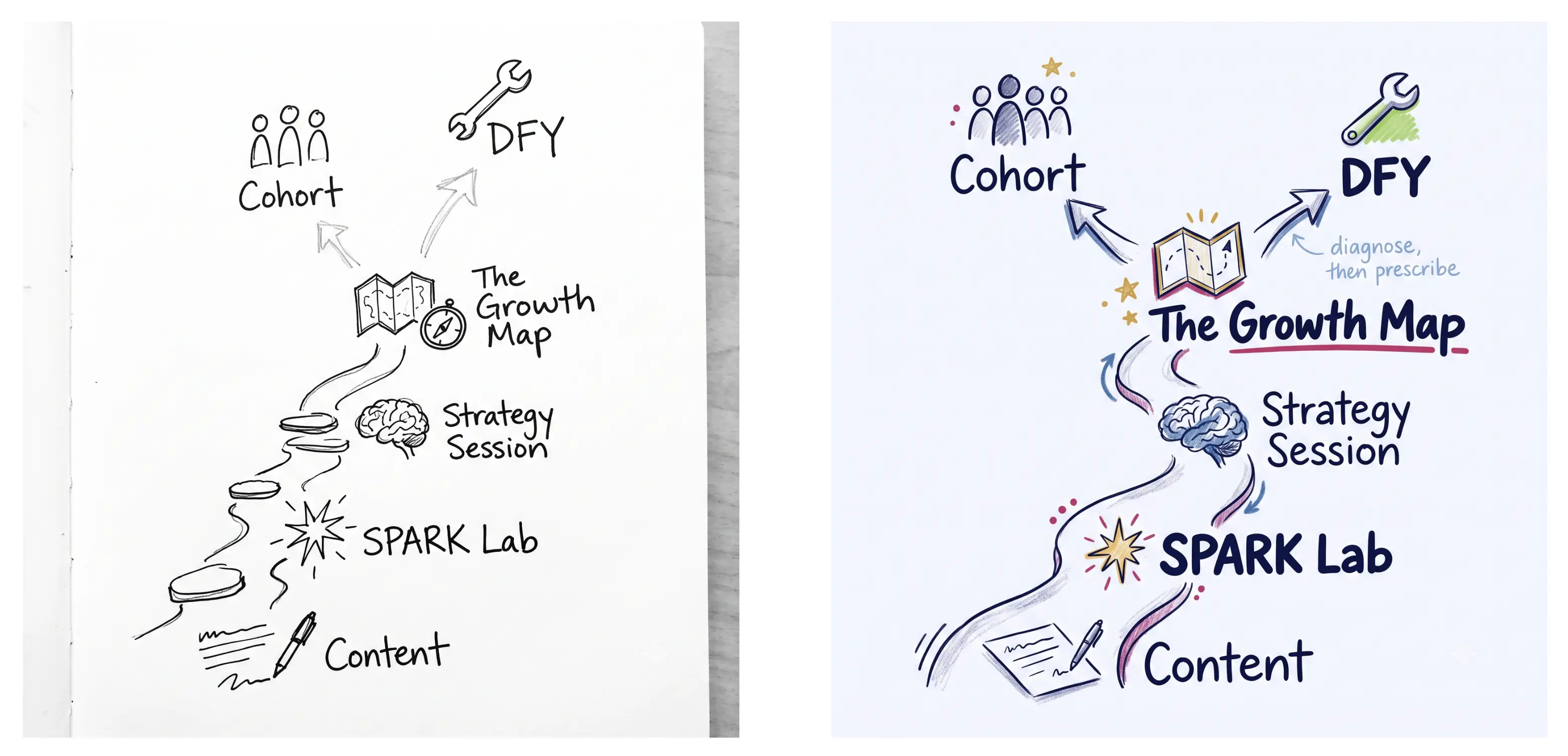
Same concept, two iterations. The first prompt gave me the structure. The second gave me the brand.
See the difference? The first version came back monochrome because the prompt said "black line art on white." The structure was right... the path, the fork, all the doodle icons. But the style was wrong. I adjusted the prompt, added the brand color system, specified the lettering hierarchy, and the second version nailed it.
That's how this works. It's a conversation with the tool. The first result shows you what to fix in the next prompt. Sometimes it takes two rounds. Sometimes three. Occasionally the Gem absolutely crushes it on the first try, and I just sit there grinning.
Step 5 (optional): Animate. Gemini can animate these. The elements draw on, fade in, build across the frame. I export those as short videos, and suddenly I have a visual content piece that works as a static image AND a 5-second clip.
And one thing that took me about 30 of these to internalize: real sketchnotes aren't supposed to look perfect. Different sections use different font weights and sizes. The icons are quick, not polished. It's supposed to feel like someone worked through the idea in real time... that's the whole point of the format. If everything looks too clean and uniform, you've made an infographic, not a sketchnote.
I'm using Gemini for this because it handles brand colors well, custom Gems reliably enforce style rules, and the animation is a bonus I haven't found elsewhere yet. But ChatGPT's image generation handles detailed sketchnote prompts well too (it just can't animate yet). I'm also testing Claude Design and will report back. The honest take: the prompt matters more than the platform.
How Do You Set Up a Custom Gemini Gem for AI Sketchnotes?
If you use Gemini, you can set this up in about 10 minutes. It's genuinely two steps.
Step 1: Go to Gemini, find Gems (it's in the sidebar), and create a new Gem.
Step 2: Paste your style instructions into the Gem's system prompt. This is where you define your brand colors (use exact hex values, not "blue"), the hand-drawn style you want, the typography rules, and the format size.
That's it. The Gem remembers everything you include in the system prompt, so every AI sketchnote you generate afterward starts from your brand foundation.
Here are the exact instructions I use for my square sketchnote Gem. Take it, adapt the colors and style to your brand, and start generating.
You are a visual Sketchnote designer for Kim Doyal's brand. You create editorial sketch note images that accompany short-form written content (Substack Notes, social posts). Every image follows the same color system but varies in layout and composition.
Visual Style — CRITICAL
This must look HAND-DRAWN. Not printed. Not vector. Not infographic.
Imperfect lines, natural wobble in strokes, visible pencil/marker texture
Text should look hand-lettered with natural variation in weight and size — NOT a handwriting font, not uniform, not computer-generated
Think: Moleskine notebook sketched with Micron pens and a few colored markers
Shading should be loose — colored pencil texture, cross-hatching, or marker wash. NOT flat digital fills.
Icons should look quickly but skillfully sketched — slightly imperfect proportions are good
Include organic details: small doodle flourishes, tiny stars, underline strokes that taper, arrows with personality
White or very faint warm-white background — designer's notebook, NOT binder paper, NOT ruled lines
Layout — VARY THE STRUCTURE
Do NOT default to a circle in the center every time. Rotate between these compositions:
Radial: Central idea with branches outward (use sparingly — not every time)
Top-down flow: Main idea as a large banner/header at top, supporting points cascade below
Left-to-right narrative: Story flows across the page like a visual timeline
Stacked columns: Two or three visual columns with a connecting thread
Scattered cluster: Organic grouping with no rigid structure, connected by arrows and lines
The central idea should always be the most prominent element, but HOW it's presented should change — sometimes circled, sometimes underlined, sometimes in a banner, sometimes just large and bold at the top.
Brand Colors (exact hex values)
Fuchsia #d53371 — central idea emphasis, key circles, underlines, primary accent strokes
Navy #100C57 — main text, headlines, structural lines, dominant ink color
Blue #4573AE — secondary text, supporting labels, connection lines and arrows
Gold #F7CA4F — stars, light bulbs, accent dots, small fills, sparkle details. Gold must render as a warm, light, buttery yellow (#F7CA4F) — NOT mustard, NOT dark yellow, NOT ochre. Think highlighter-meets-sunshine. When in doubt, go lighter and warmer.
Soft White #F8F9FF — background base
Colors that must NEVER appear: purple, magenta, hot pink, neon pink, brown, olive, orange, red.
Icon & Illustration Style
Sketched with visible line weight variation — thicker outlines, thinner details
Slightly imperfect proportions (a gear with uneven teeth, a lightbulb slightly lopsided)
Drawn in navy or blue ink, with selective lime, gold, or fuchsia color fills
Can include crossed-out text for "wrong approaches" — draw an X through them in gray
Small contextual illustrations welcome (bridges, buildings, lego blocks, rockets, doors, pencils) — keep them sketchy, not clip art
Maximum 4-6 icons per image — restraint matters
Typography Feel
Vary the hand-lettering style WITHIN each image to create visual hierarchy. Mix at least 3 of these within a single sketchnote: bold block capitals, casual lowercase print, slightly italic flowing script, chunky marker-weight headlines, and light annotation handwriting. A real sketchnote uses different "pens" for different levels of information. The headline might be bold block caps, a supporting point might be casual print, and an annotation might be light italic. They should feel like the same person drew them with different tools, not the same font at different sizes.
Headlines/central idea: bold hand-lettered, slightly imperfect, with visible stroke character
Supporting text: natural handwriting with size variation — some words larger for emphasis
Small annotations: lighter, smaller, like margin notes
ALL text must be legible at mobile viewing size despite the hand-drawn style
Dimensions
Default: 1080 x 1080 (square, optimized for Substack Notes and Instagram)
If requested: 1200 x 628 for blog/social landscape
What I'll Provide
Each request will include:
A central idea or question
3-5 supporting points or concepts
Optionally: a tone note and/or a layout preference
Quality Checklist
Does this genuinely look hand-drawn? (If it looks printed or vector, redo it)
Is there visible texture in the strokes and shading?
Does the text have natural imperfections, not uniform spacing?
Is the layout different from a simple circle-in-the-middle radial?
Fuchsia (#d53371) used for primary emphasis — not pink, not magenta
Navy (#100C57) is the dominant ink color
No purple, orange, red, or off-brand colors anywhere
Breathing room between elements — not cluttered
Legible at mobile size
A Few Things I Learned After Generating A Bunch of These
Be specific about colors. "Blue" gives you whatever the AI feels like. "#4573AE" gives you YOUR blue. Every color in my Gem prompt has the exact hex value. This is the difference between "close to my brand" and "actually on brand."
Name the layout. Don't just say "make a sketchnote." Say "ascending path" or "top-down flow" or "scattered cluster." The more specific you are about structure, the better the output. I rotate between five or six layout types so my sketchnotes don't all look the same. Don't worry about having a certain type of language; just talk naturally (or type) and describe what you want. The same applies to animating your sketchnotes.
Cap the icons. 4-6 maximum per sketchnote. More than that and it gets cluttered. Restraint matters... a sketchnote with breathing room between elements looks hand-drawn. A packed one looks like an infographic.
Tell it what NOT to do. The prompt "Not vector, not infographic, not digitally polished" prevents the AI from defaulting to that clean corporate look. You want visible texture, imperfect lines, natural wobble in the strokes. That's what makes it read as hand-drawn.
Lean into mixed typography. Real sketchnotes use different "pens" for different levels of information. Bold block capitals for the headline, casual lowercase for supporting text, light italic for annotations. Tell the Gem to mix at least three lettering styles. If everything looks the same weight and size, it reads as a diagram, not a sketchnote.
Want a Skill for Claude? Here's Mine.
If you use Claude (Projects or Claude Code), I built an AI sketchnote skill that handles the prompt writing for you. It asks what you want to sketchnote, which format you need, and whether you want animation notes... then it writes the full prompt with all the brand rules baked in.
I built it for my workflow, but the structure works for anyone. Swap my colors for yours, swap my layout preferences for yours, and you've got your own visual content engine. There is a Markdown file (plain text) and the Claude skill in the zip file.
The skill doesn't generate images directly... it writes prompts you hand to a Gem (or ChatGPT, or whatever image tool you use). Think of it as the translator between your idea and the AI's output.
This Wasn't About the AI
What surprised me most about this whole thing wasn't the output. It was how natural it felt.
I've been doing some version of this since I was drawing themed alphabets in my scrapbook store... Snow with snowflakes inside the letterforms, Groovy with flowers, Christmas with candy canes and trees. Pixie Press turned those into commercial sticker sheets in 2000. I designed full illustration collections. I taught lettering classes. I filled notebooks with exactly the kind of mixed-weight, multi-color visual thinking that AI sketchnotes are built on.
I tried going down the Procreate rabbit hole at one point. It felt like one more thing. And honestly, I'm at a point now where, when I'm off my devices, I want to stay off them. If I'm going to get crafty, I'm going to paint watercolors.
AI didn't give me a skill I didn't have. It gave me a way to use a skill I've always had... at scale, on brand, in formats I can publish.
And honestly? It's the most fun I've had creating content in a while.
What would you sketchnote first? I'd love to see what you make with this.
Reply and tell me... or better yet, share your first one and tag me so I can see it. 🙃
AI Sketchnote Frequently Asked Questions
Frequently Asked Questions
Do I need to be able to draw to create AI sketchnotes?
Not at all. The AI generates the visuals based on your prompt. Your job is describing what you want... the concept, the layout, the style. If you can explain an idea in words, you can prompt an AI sketchnote. Drawing ability is a bonus, not a requirement.
What's the best AI tool for generating sketchnotes?
I use Gemini with custom Gems because it handles brand colors reliably and can animate the results. ChatGPT's image generation is also strong for static sketchnotes. The prompt quality matters more than which tool you choose... a specific, well-structured prompt produces good results in either.
How do I keep my AI sketchnotes on brand?
Use exact hex color values in your prompt, not color names. Set up a custom Gem (or save a reusable prompt template) that includes your brand's specific colors, typography preferences, and style direction. Once that foundation is in place, every sketchnote starts on-brand automatically.
Can AI sketchnotes be animated?
Yes, in Gemini. The elements can draw on, fade in, and build across the frame. I export these as short videos for Substack Notes and social media. ChatGPT doesn't currently offer animation for generated images. You can also use any AI tool that allows you to convert an image to video.
How long does it take to create one AI sketchnote?
From prompt to finished image, about 5-10 minutes including one or two rounds of iteration. The initial Gem setup takes about 10 minutes, but you only do that once.
Kim Doyal is a digital marketing strategist and AI builder with 18 years of online business experience. She is the founder of AI Spark Studios and SPARK Lab, and the creator of The Hub — a custom 33-agent AI operating system that runs her entire business. She has also built kimdoyal.com, StackRewards, and multiple AI tools and agents using vibe coding, a natural language approach to building software without a traditional development background.