HOME/BLOG/HOW I USED CLAUDE DESIGN TO REBUILD A LANDING PAGE I WAS TOO EMBARRASSED TO PROMOTE
AI Building
How I Used Claude Design to Rebuild a Landing Page I Was Too Embarrassed to Promote
How one design session changed everything I build
May 27, 2026|5 min read
When I was 18, I wanted to be a graphic designer.
I took art classes all through high school, declared graphic design as my major in college, and spent every spare hour drawing or painting because I genuinely believed this was my path. I was good... (am good, if I do say so myself), but like many kids that age, I doubted myself more than I should have. I also didn't know if I had the stomach to handle the criticism.
This was 1990. Computers existed, but graphic design was still drafting tables, X-Acto knives, and hand-rendered type. The competition felt enormous, so I stepped away from the major and went in a different direction.
But here's what I didn't stop doing.
I never stopped caring about how things looked, never stopped noticing when something was beautiful versus merely functional. Years later, when I opened my scrapbook store, I designed font stickers that were picked up and published. The design impulse was always there... it just kept getting redirected into different containers. WordPress themes I'd obsess over customizing. Brand colors I refused to compromise on. The way a landing page made me feel before I even read the copy.
I've said it a bazillion times, and I'll say it again: if something is ugly, I bounce. I really, really do. And I know I'm not the only one.
That instinct... the one I thought disqualified me from being a "real" designer 35 years ago... turned out to be the exact skill that matters most when you're building an AI assessment for entrepreneurs or anything else that needs to earn trust on sight.
What Happens When You Build a Design System Without a Prompt?
Something surprising, as it turns out... your existing decisions become the prompt.
I've been building my website on Next.js with Claude Code for a while now, hosted on Vercel, and I genuinely love how it looks. My brand colors (fuchsia, navy, lime, gold, blue) have been consistent since my WordPress days, the typography is dialed in, and the overall feel of kimdoyal.com makes me happy every time I open it.
So when Claude Design launched, I was curious but not desperate. I didn't need a redesign... I wanted to see what would happen if I took everything I'd already built and let Claude Design turn it into a proper design system.
And this is the part that still makes me laugh.
I didn't even give it a prompt.
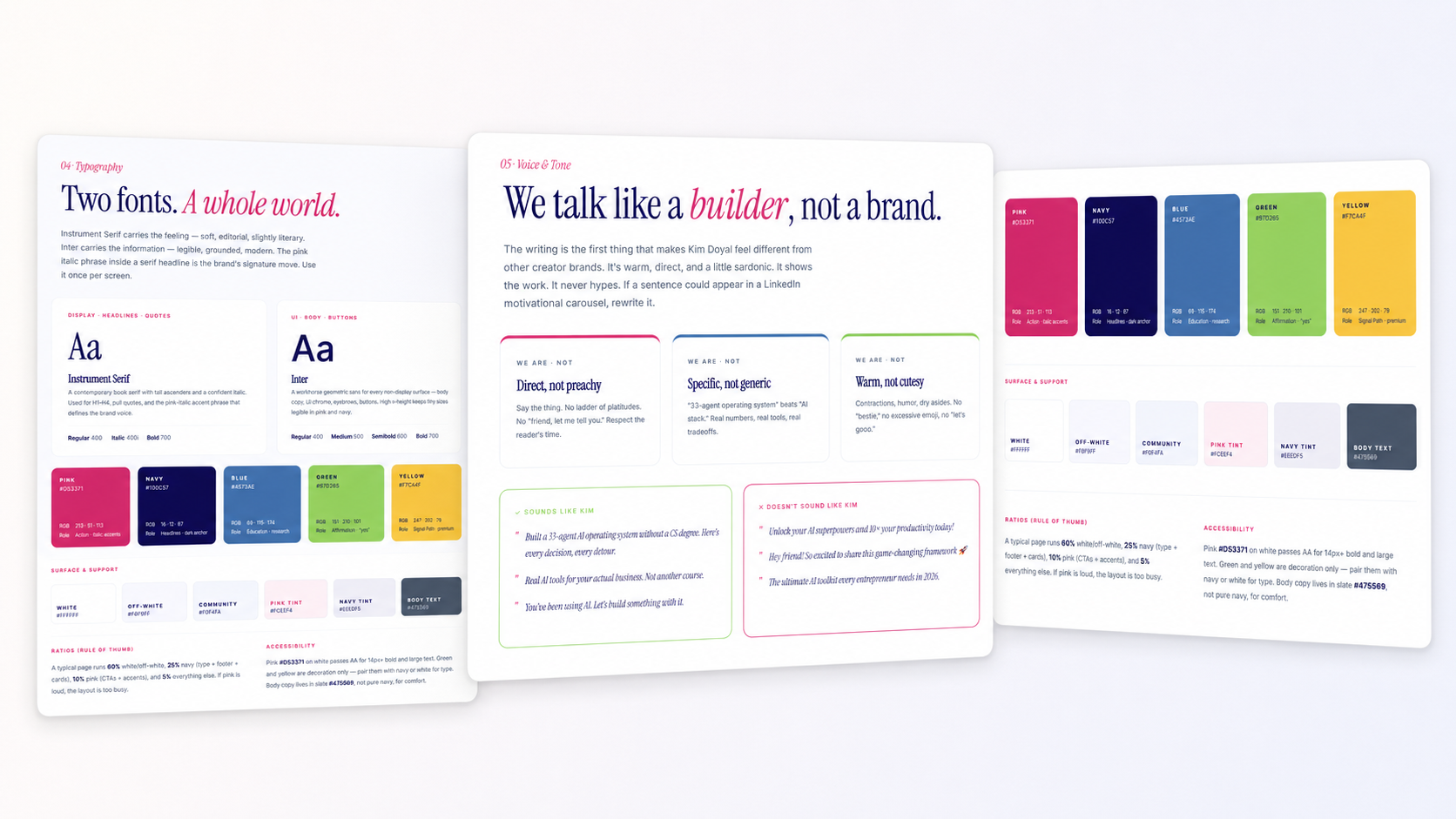
I pointed Claude Design at my website, uploaded my logo, clicked the button, and watched it go. It explored my fonts, my color tokens, my components, my page structure, my globals.css... all the thousands of small design decisions I'd made building this site. And it organized all of those decisions into a cohesive design system with a brand guide, type specimens, and component specs.
The design system Claude Design built from my existing codebase... typography, voice and tone rules, color ratios, and accessibility specs. No prompt required.
Let me say that again, because I think it's easy to gloss over.
I didn't describe my brand to an AI and ask it to create something from scratch. The AI read what I'd already built and reflected it back to me as a system. My experience was the input. My years of design decisions, my preferences, my eye for what felt right... that was the prompt.
Your experience is the asset.AI is the build tool. I keep saying it because I keep living it.
Why Did a "Good Enough" Landing Page Kill My Motivation to Promote?
Because if you're not excited about it, you're not going to tell anyone else about it either. And that's exactly what happened to me.
Before I tried Claude Design, I had been building projects for other people, as well as my own... a credit education platform called Her Credit Map with an adorable wallet mascot (in progress), and a direct-booking vacation rental site called Vita de Playa with an AI-powered local guide. Each one has its own brand, visual system, and personality, and I was having a blast designing them.
And then I went back and looked at my AI Advantage Profile Assessment landing page.
Oof.
The assessment itself was solid... I'd built it, rebuilt it, refined the scoring logic, tested the email sequences, and iterated on the results page until the whole engine under the hood was genuinely good. But the landing page? The thing people actually see first? It was... meh. It worked, but after spending weeks building beautiful things for other projects, "fine" felt like it was actively working against me.
Here's the thing about being a solopreneur: you can't always see the forest for the trees. I'd been so deep in the mechanics of the assessment... the 3x3 matrix, the scoring system, the Bento integration, the email sequences... that I'd neglected the front door.
The landing page never excited me, so I never really promoted the assessment the way I should have. I'd share it occasionally, but there was no pride behind it, no "you have to see this" energy.
I think a lot of solopreneurs do this. We build something genuinely valuable and then let it sit behind a mediocre first impression because we ran out of steam on the presentation layer, or because we couldn't quite execute the design we could see in our heads, or because "good enough" felt like the only realistic option when you're one person doing everything.
That's not a good enough reason anymore... not when you have the tools to do better.
How Do You Go From Design System to a Landing Page That Actually Converts?
You become the art director. That's the real skill, and it's the one most people skip.
I've been completely sucked into everything Pinkie from AI Meets Girlboss is sharing on Substack. She's a visual brand strategist, and she's brought this incredible energy to showing solopreneurs how to use AI image generation tools to build a real brand... not a template, not a Canva shortcut, a brand. She claimed a space for visual branding on a platform that used to feel like it didn't even want visuals, and watching her do it reminded me that the visual layer matters... not as decoration, but as the first signal of whether something is worth someone's time. Her showing up the way she has is part of what made me go all in on getting my own design right.
So I decided the assessment landing page needed to match the rest of my brand. I took the copy (which I'd already rewritten with my audience in mind) and my full design system into Claude Design and asked it to build a landing page from scratch.
The first version was clean and editorial... it felt like a Substack post that happened to be selling something, which was intentional. It had my Pixar portrait as a small circular anchor, the quote I love about experience being your unfair advantage, fuchsia accents, and a simple single-column flow. It was good, but it wasn't "it" yet.
So I asked for a second variation, and that's when it got fun.
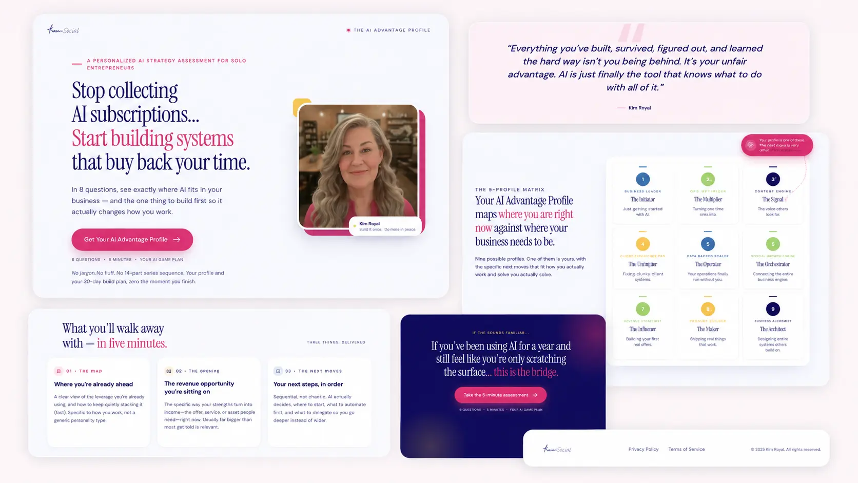
The full landing page mockup from Claude Design, broken into sections. Hero, quote, the 9-profile matrix, what you walk away with, and the navy closer. All built from my existing design system.
V2 came back as a magazine spread with an asymmetric hero... headline on the left, a larger portrait on the right with a small pink offset block and a "Built by Kim · 18 years in" signature pill. A full-bleed pink-tint section made the quote hit harder. And then the thing that made me go "yes, THAT"... a visual 3x3 grid showing all nine profiles with a "You are here" marker in fuchsia... although that took a few variations, because initially it was pretty boring. I downloaded the HTML version of the page from Claude Design, took a screenshot of the boring section, and then uploaded it to ChatGPT and asked for something better (in more specific language). It made the concept tangible instead of abstract. You could actually see the matrix and imagine where you might land.
The navy closer section at the bottom gave the whole page a confident finish... dark background, soft pink and gold glows, a second CTA.
It felt like the page knew what it was.
What struck me about the whole process was how much it felt like working with a designer rather than a tool. I still had to art-direct, still had to know what I wanted, what felt right and what felt off, when to push for another iteration, and when something had landed. The 35 years of caring about visual quality... of noticing what makes something feel premium versus forgettable... that was the actual skill. Claude Design was what finally let me execute at the level I'd always been able to see in my head.
The 18-year-old who thought she wasn't good enough to be a graphic designer? Her time has come.... she just needed the right tools for her.
What's the Difference Between a Quiz and an Assessment Engine?
About a thousand lines of custom code, a 3x3 scoring matrix, and nine completely different outcome paths. Let me explain.
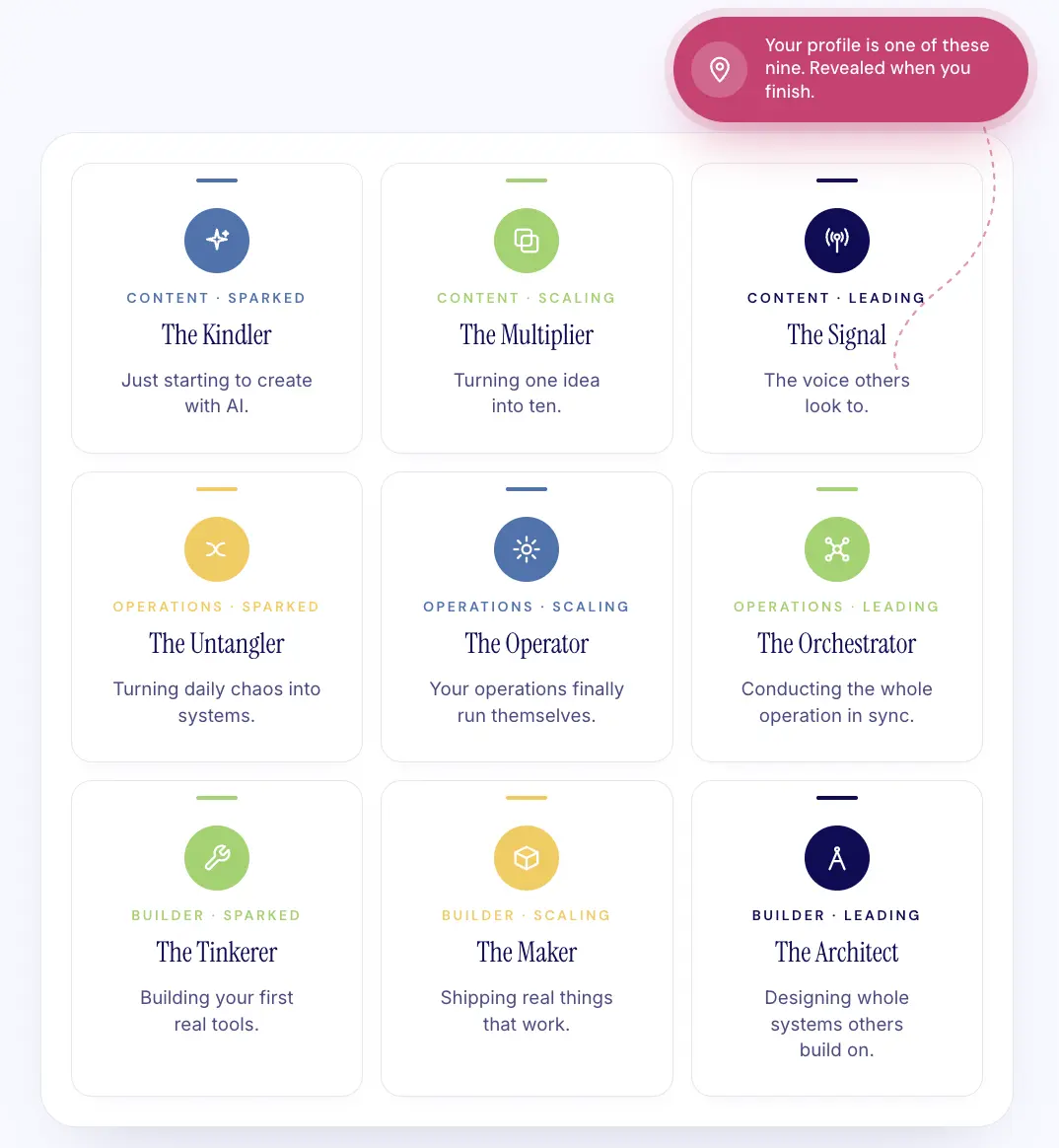
I stopped calling this a "quiz" because that word undersells what it actually does by about a mile. The AI Advantage Profile Assessment is built on a 3x3 matrix with three focus areas (Content, Operations, Building) crossed with three levels (Sparked, Scaling, Leading). That gives you nine possible profiles, and each one maps to a genuinely different stage with genuinely different next moves.
The 3x3 matrix behind the assessment. Three focus areas, three levels, nine profiles... each with its own revenue opportunity, next steps, and action plan. Your profile is revealed when you finish.
The Kindler is just starting to create with AI. The Multiplier is turning one piece of content into ten and is ready to package that system as a product. The Operator has automations running, but they're not yet talking to each other. The Architect is designing entire systems that others build on. These aren't cute personality labels... they map where you are right now against where your business needs you to be.
And I call it an assessment because of what happens after you answer the eight questions. That's where the real value lives, and it's the part most people haven't seen yet.
What Do You Actually Get When You Take the AI Advantage Profile Assessment?
A full diagnostic... not a fun label and a pat on the back. Here's what's on the other side of those eight questions.
Your Personalized Results Page
When you finish the assessment, you land on a results page that breaks down your scores across all three focus areas and gets genuinely specific about what they mean for your business.
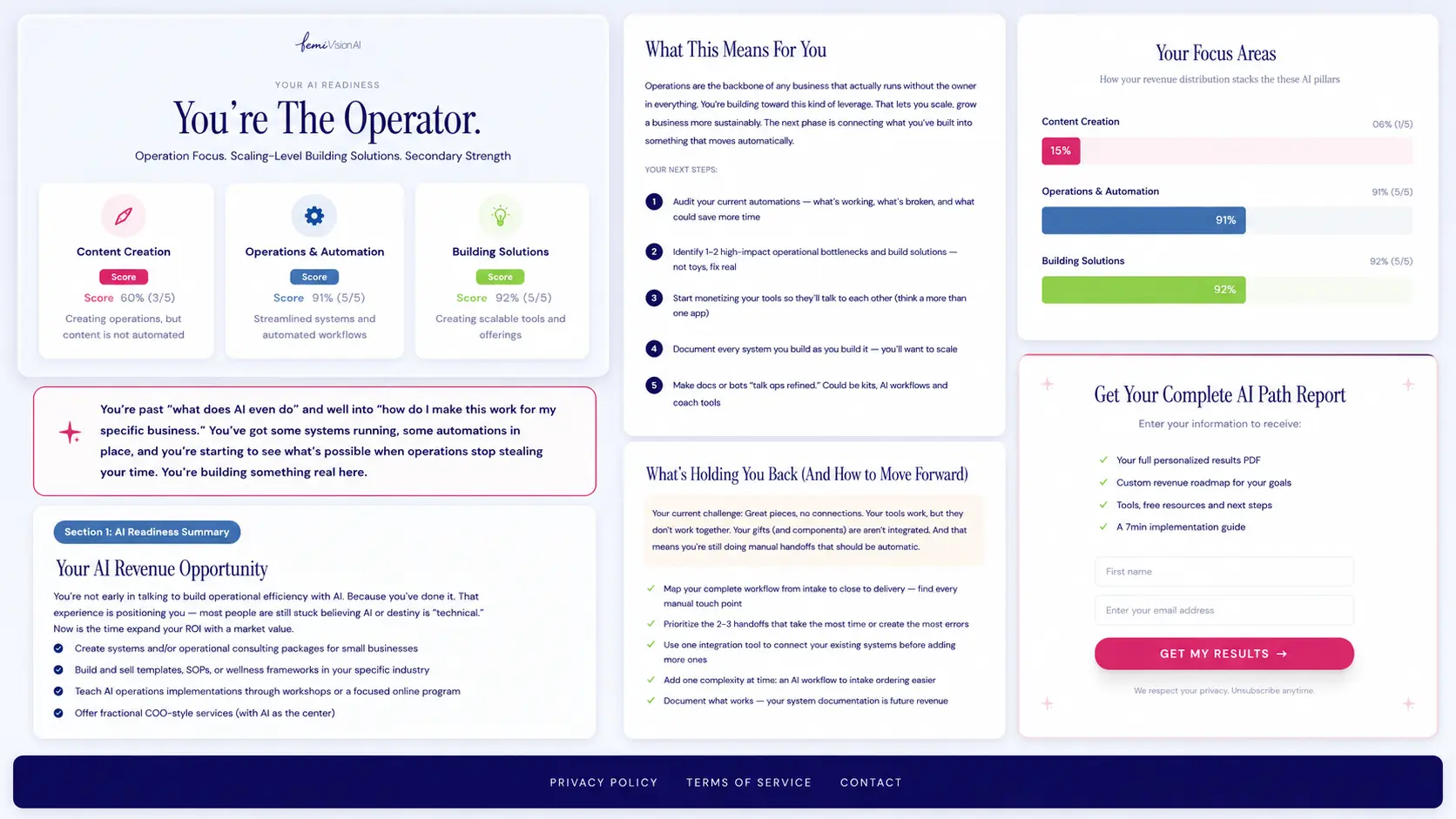
The full results page for The Operator... scores across all three focus areas, your AI revenue opportunity, numbered next steps, what's holding you back, and the opt-in for your personalized PDF. This isn't a quiz result, it's a diagnostic.
You see your scores across Content, Operations, and Building, with a personalized description of where you are and what it means. And then it goes deeper than most assessments ever bother going.
Your AI Revenue Opportunity. Based on your profile, the assessment identifies the specific type of work you're positioned to monetize right now. If you're The Multiplier (Content focus, Scaling level), your revenue opportunity is as a Content Systems Expert... because you've already built the content workflows that other creators are still trying to figure out, and that knowledge is worth real money as a workshop, template bundle, or done-with-you offering. If you're The Operator (Operations focus, Scaling level), it's about productizing your systems knowledge through audits, consulting packages, or fractional COO-style services with AI at the center. Each profile gets a different revenue model because each profile is a different business.
Your Next Steps. Not generic "learn more about AI" advice. Numbered, ordered, specific steps based on your profile. The Operator's first step is to audit their current automations to figure out what's working, what's broken, and what's still manual when it shouldn't be. The Multiplier's first step is to map their full content workflow from idea to published and find the 2-3 handoffs that still eat their time.
What's Holding You Back (And How to Move Forward). This is the section that tends to make people pause, because it names the specific pattern that's keeping them stuck. The Multiplier's challenge? "Tools without bridges. You've outgrown the basics, but you haven't fully crossed into system thinking." The Operator's? "Great pieces, no connections. Your tools work, but they don't work together." Each diagnosis comes with a clear action list for getting unstuck.
Your Focus Area Distribution. A visual breakdown showing how your answers clustered across Content, Operations, and Building... so you can see not just your primary profile but where your secondary strengths are and where the gaps live.
Your Personalized PDF
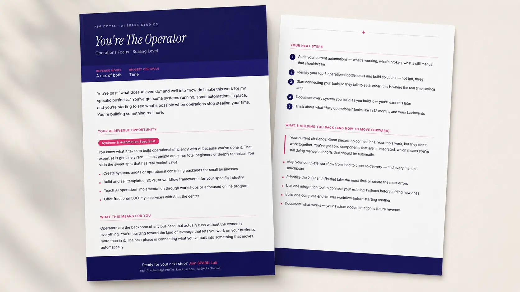
After your results page, you opt in to receive a beautifully designed PDF that includes your complete profile, revenue model, biggest obstacle, and full action plan. Not a 60-page ebook that sits in a downloads folder forever... a focused, designed, one-page diagnostic you can actually reference and come back to.
The personalized PDF you get after opting in... your profile, your revenue opportunity, your next steps, and what's holding you back. Designed to match the brand, not a generic lead magnet.
I designed this PDF the same way I designed the landing page... with the brand system, with intention, with the understanding that if it looked like a generic lead magnet, nobody would take it seriously. The Instrument Serif headings, the navy-and-fuchsia color system, the numbered steps with branded circles... it all matches because it should.
Your Customized Email Sequence
And then, over the next few days, you receive a personalized email sequence tailored to your profile. This isn't a generic welcome series, and it's not seven emails about how great AI is. The emails are customized to your assessment results with recommendations and next steps that are specific to whether you're a Kindler, a Multiplier, an Operator, or any of the other nine profiles.
The whole system runs on Bento. When you complete the assessment on kimdoyal.com, your results flow into Bento with your profile data... your focus area, your level, your biggest obstacle, your revenue model... and Bento triggers the right email sequence based on which of the nine profiles you matched. Different profile, different sequence, different recommendations. That's what building a real assessment engine looks like versus slapping a Typeform on a landing page.
How Did I Build This Without Being a Developer?
With the same approach I use for everything: knowing exactly what I wanted and describing it clearly enough for AI to build it. That's vibe coding in practice.
The assessment lives on kimdoyal.com, which is built on Next.js and hosted on Vercel. I built the whole site with Claude Code... the assessment engine, the scoring logic, the results page with dynamic content, the PDF generator, all of it. The design system was created in Claude Design and then implemented through Claude Code. The email sequences run through Bento, with assessment results synced automatically so each subscriber gets their profile-specific sequence.
No quiz plugin. No third-party assessment tool. No limitations on what I could customize, because I built the whole thing myself.
And before anyone says, "well, you're technical"... I was a graphic design dropout who spent 18 years in WordPress before touching a line of code in Next.js. And everything I learned with WordPress was self-taught (and I still had a developer I worked with). I never learned PHP or CSS. I'm not a developer. I'm someone who knows her business well enough to describe what she wants, and AI is finally the tool that can build it. That's vibe coding. That's what I mean when I say your experience is the asset.
I have used a TON of different tools and software, spent many years in management, and have an eye for design. I know what I like/don't like about the experience from a user perspective, and that's how I approach building.
Here's the real skill breakdown behind this assessment engine, because I want you to see what actually mattered versus what you'd think mattered:
What mattered: I knew which information I needed to capture to personalize an email sequence. I understand what a good user experience feels like when you're taking an assessment, and I know my audience well enough to write 9 different revenue-opportunity sections that actually land. I've spent 18 years forming very strong opinions about what makes a landing page ugly versus inviting & conversion focused, and I understand how email marketing automation works at a conceptual level... not the code, but the logic.
What didn't matter: How to code a scoring algorithm. The syntax for PDF generation in React. How to wire a Next.js API route to Bento's subscriber endpoint. Claude Code handled all of that. I just had to describe what I wanted clearly enough, review the output, and iterate.
That's the whole job.
What If You've Built Something Good But Can't Get Yourself to Promote It?
Ask yourself whether the problem is the thing itself or the container you put it in. That distinction changed everything for me.
This assessment has existed in different forms for a while now... this isn't the first version, and it might be the third. The scoring has been refined, the profiles sharpened, and the copy rewritten more than once. And through all of that iteration, I never promoted it with real conviction because the presentation never matched the substance.
That changed when I stopped accepting "good enough" for the design layer.
The lesson here isn't really about Claude Design, landing pages, or even the assessment itself. It's about the gap between what you've built and how you've packaged it. I had a genuinely valuable tool sitting on my site, quietly underperforming because the front door didn't invite people in the way the experience inside deserved.
If you've built something good and you're not sharing it with pride... It's worth sitting with that question. Is it the product? Or is it the packaging? Because if you've got the eye... if you've always known what good design feels like even when you couldn't execute it yourself... the tools exist now. That's not an excuse anymore... it's an invitation.
Take the Assessment
Eight questions. Five minutes. You'll get your AI Advantage Profile, a full results page with your revenue opportunity and specific next steps, a designed PDF with your complete diagnostic, and a short email sequence customized to your profile.
No 14-email sales pitch on the other side. Just your profile, your plan, and an open invitation to go deeper if you want to.
How long does the AI Advantage Profile Assessment take?
Eight questions, about five minutes. The questions are multiple choice, and there's no wrong answer... each one maps to one of the three focus areas (Content, Operations, Building) at one of three levels (Sparked, Scaling, Leading).
Is this just another personality quiz?
No. It's a diagnostic built on a 3x3 matrix that identifies where you are with AI right now and maps that to specific revenue opportunities, next steps, and what's holding you back. The output is actionable, not decorative.
What happens after I get my results?
You see your full results page immediately, then opt in to receive your personalized PDF and a short email sequence customized to your specific profile. The emails include recommendations and next steps based on whether you're a Kindler, Multiplier, Operator, or any of the other nine profiles.
Do I need to be technical to take this?
Not at all. The assessment is about your business experience and how you're currently using AI, not your technical skill level. Most of the profiles are about strategy, content, and operations... not code.
Your obvious offer is hiding in plain sight.
Free. Tell it what you know and who you help, and it'll show you the offer everyone can see but you.
Kim Doyal is a digital marketing strategist and AI builder with 18 years of online business experience. She is the founder of AI Spark Studios and SPARK Lab, and the creator of The Hub — a custom 33-agent AI operating system that runs her entire business. She has also built kimdoyal.com, StackRewards, and multiple AI tools and agents using vibe coding, a natural language approach to building software without a traditional development background.