TABLE OF CONTENTS
What Visualizer Actually Is (And Isn't)How I Actually Use This (For Everything)The Full Capability MenuFlowcharts and Process DiagramsInteractive WidgetsData VisualizationsUI MockupsComparison LayoutsTimelines, Architecture Maps, and ExplainersThe Content Map for This ArticleYour Turn: Build a Brand Strategy BoardWhy "Show Me" Changes What You Can ThinkAI Tools


How Claude Visualizer Changed the Way I Plan, Build, and Think
How Visualizer changed the way I plan, build, and think with AI
March 31, 2026|5 min read
I was catching up with a friend I hadn't talked to in a while. She knew I'd gone all in with AI, but hadn't really seen what I'd been up to. So I started telling her about it... the hub I'd built, the agents, the workflows. She was interested, nodding along, asking good questions.
And then I stopped talking and started showing her (that never gets old).
I pulled up Claude and started demoing some of the things I've built. She was already impressed, but when I jumped into Visualizer and started mapping things out right there in the conversation... that's when it shifted. Not just "oh, that's cool" but genuine "wait, WHAT is happening right now" energy.
That moment made me realize something about my own workflow. Visualizer has become such a core piece of how I work (in the whopping few weeks it's been out) that I almost forgot it would be surprising to someone seeing it for the first time. I use it for planning, strategy, mapping out systems, and article visuals... it just lights me up (simple pleasures, right?). The ability to think visually inside the same conversation where I'm thinking verbally has changed how I approach almost everything.
But here's the thing. My friend isn't some random person who barely uses tech. She's smart, she's in business, she's used AI. And she had no idea any of this was possible.
That's when I knew I needed to write this article.
What Visualizer Actually Is (And Isn't)
Let me clear something up, because the name might throw you off.
Visualizer isn't an image generator, and it doesn't create photos or illustrations. What it actually does is build diagrams, interactive tools, and data visualizations that render right inside your conversation, inline with your messages, not in a separate window or as a file you need to download somewhere. It just appears between your messages as though it belongs there.
Before your eyes glaze over, let me translate two terms you're going to see throughout this article:
DEFINITION
SVG (Scalable Vector Graphics)
I had no idea what this was for the longest time, so no judgment here. It's basically code that draws an image. Instead of pixels (like a photo), it's a set of instructions that says "draw a box here, put text there, connect these with an arrow." The result looks like a crisp, clean graphic... but it's actually just code underneath. That's why Claude can build and modify them on the fly during a conversation, because it's writing instructions, not painting pixels.
DEFINITION
HTML Widgets
These are the interactive pieces. Think of them as tiny web apps that live inside your chat. Calculators you can actually type numbers into, sliders you can drag, charts that update when you change the inputs. If you've ever used a website (and you have), you've used HTML. These are just small, focused versions of that, built for one specific purpose.
Now that we've got those out of the way... the reason this matters is that the whole thing is conversational. You don't need to write code or know any special syntax. You literally say, "Show me a flowchart of my content process," and Claude builds one. You say, "Actually, add a step between editing and publishing," and it updates. You say, "Make it horizontal instead of vertical," and you get a new version. It's Claude thinking visually instead of verbally, and sometimes that's exactly what you need.
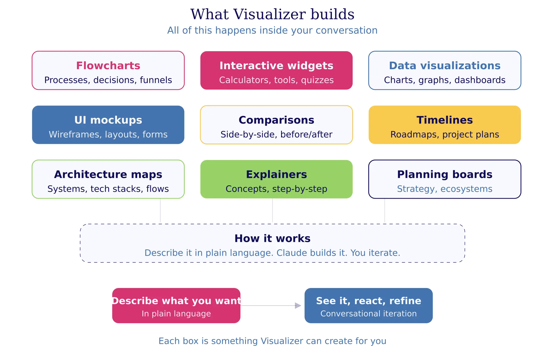
Here's the full landscape of what Visualizer can build:
How I Actually Use This (For Everything)
I want to be honest about something. People keep asking me how AI saves me time, and I keep giving the same answer: it doesn't. I'm working MORE. But it's the kind of work that makes me lose track of time, the kind where three hours feel like twenty minutes because I'm so deep in the creative zone that I forget to eat lunch. (This happens more than I'd like to admit.)
Visualizer is a huge part of that.
Here's what my actual usage looks like:
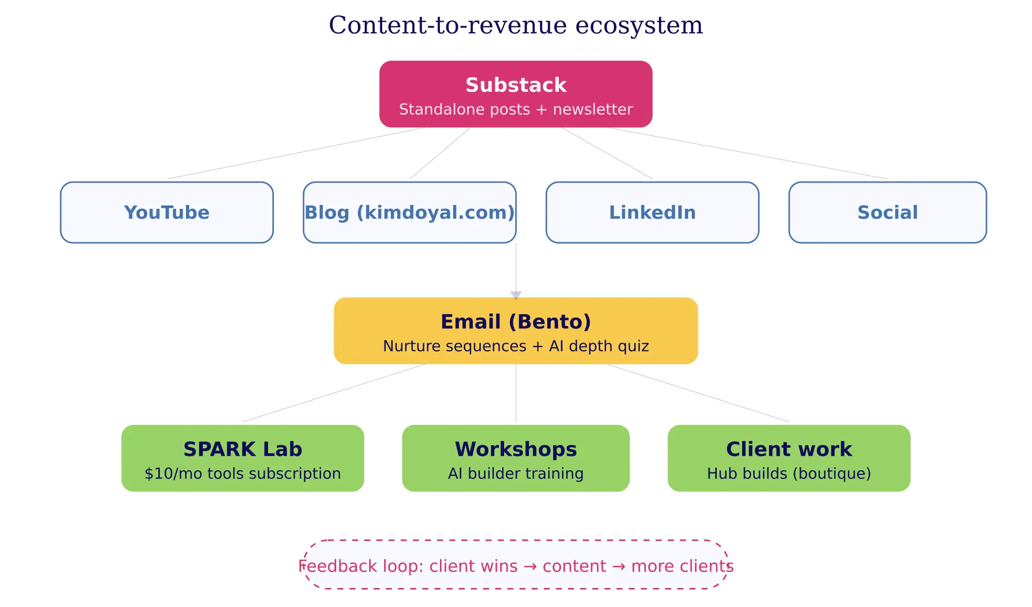
Planning my entire business ecosystem. I mapped out every offer, every content channel, every funnel, every connection between them... visually, in a single conversation. And when I realized my email sequences weren't aligning with my Substack strategy the way I thought they would, I could literally SEE the gap. You can't get that from a bullet-point list, no matter how well organized it is.
Strategy sessions before I build anything. Before I wrote a single line of code for my 33-agent AI system (yes, I built 33 AI agents... that's a whole other post), I used Visualizer to map the architecture. Which agents talk to which, where the data flows, and what happens when something breaks. Seeing it visually meant I caught design problems before they became real problems that cost me hours to untangle.
Article planning and structure. This is going to get a little meta, but I used Visualizer to plan the article you're reading right now. Not an outline (though it can do that too)... I mean a visual content map that shows the hook, the story section, the teaching section, the practical piece, how they all connect, and where the reader's emotional arc goes throughout the piece. It changed how I think about structure entirely, because I can see when something is disconnected or when I'm asking the reader to jump too far between ideas.
In-article visuals and deeper dives into concepts. I use Visualizer to create diagrams and charts that go INTO my articles, and I use it whenever I need to understand something spatially rather than linearly. Decision trees, comparison matrices, process flows... asking Claude to visualize a concept instead of explaining it has become my default move.
The Full Capability Menu
Let me walk through what Visualizer can actually build. And I'm not just going to describe these... I'm going to show you a real example of some of these, because this whole article is about seeing rather than reading.
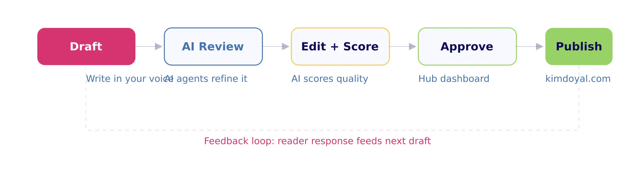
Flowcharts and Process Diagrams
Your content workflow, your client onboarding process, your "what happens when someone hits my landing page" funnel map... anything with steps and decisions looks better as a flow than as a paragraph. Here's a simple content publishing workflow:
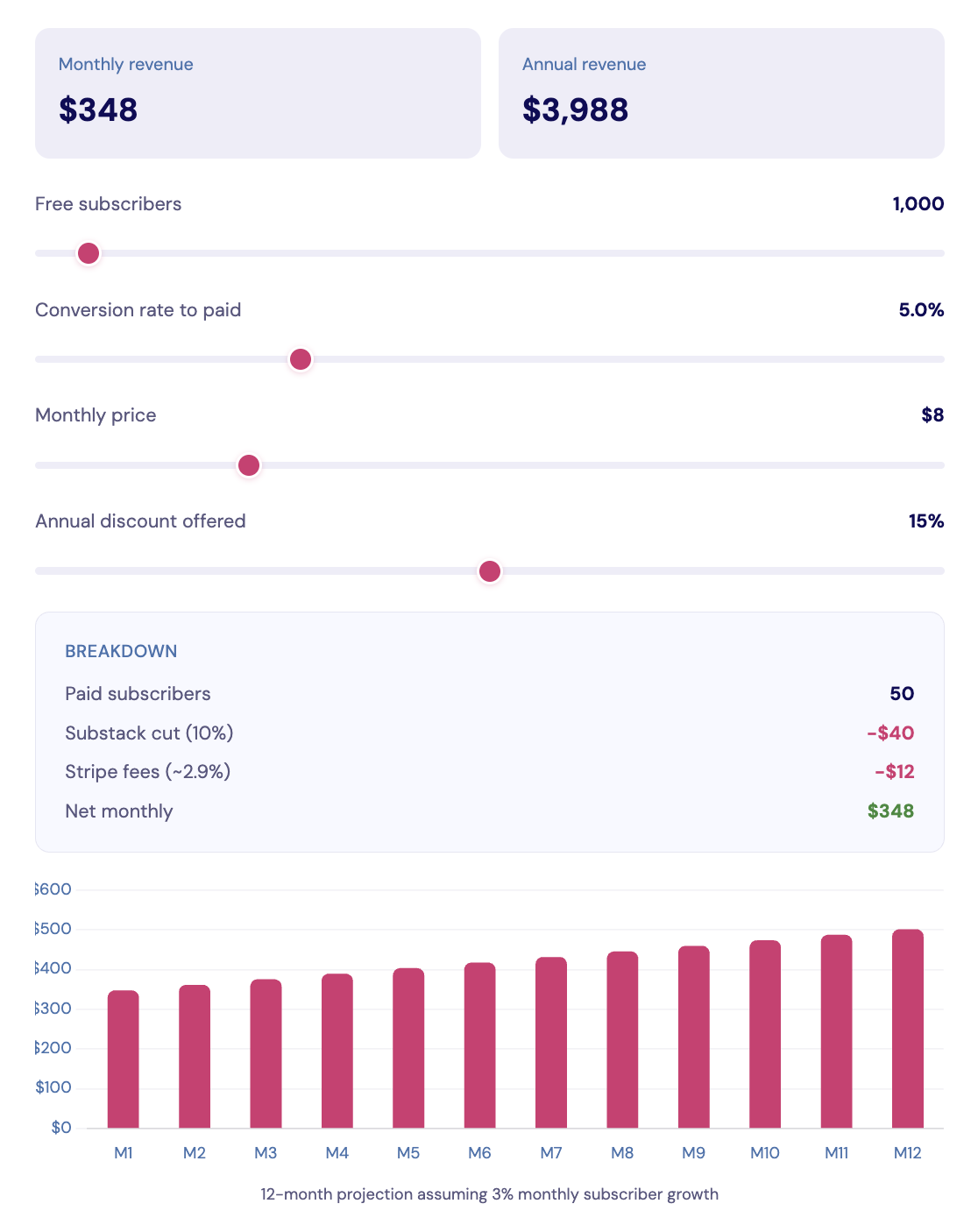
Interactive Widgets
This is where it gets really fun, and honestly, where I think most people have no idea what's possible. Visualizer can build actual working tools inside your conversation. Here's a Substack paid tier ROI calculator... (you can drag the sliders in Claude, not here):
The prompt that built this was basically: "Build me an interactive calculator that helps someone figure out whether a Substack paid tier is worth it. Include subscriber count, conversion rate, monthly price, annual discount, and show the net revenue after Substack and Stripe fees. Add a 12-month projection chart."
That's it. Two rounds of iteration, five minutes total.
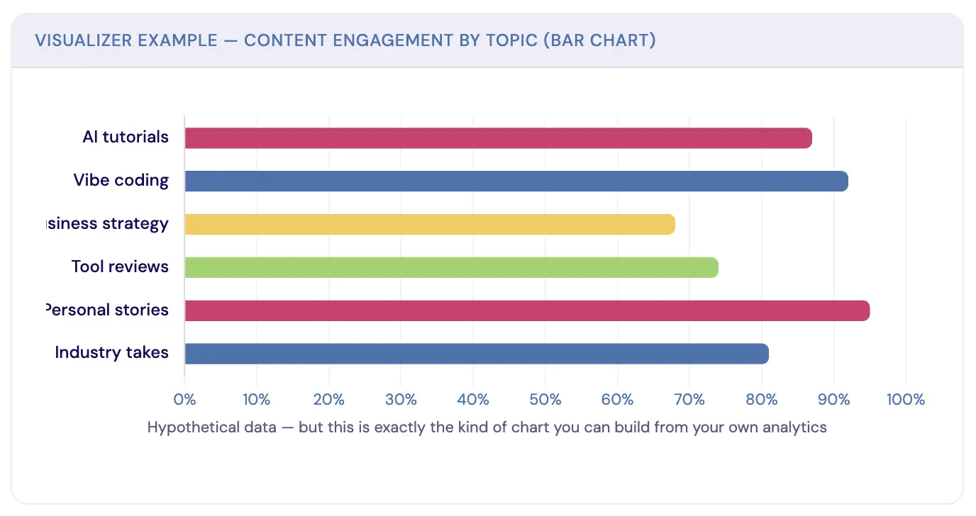
Data Visualizations
Bar charts, line graphs, pie charts, and radar charts. If you have numbers and need to see the story they're telling, Visualizer is faster than opening a spreadsheet. Here's a content engagement breakdown:
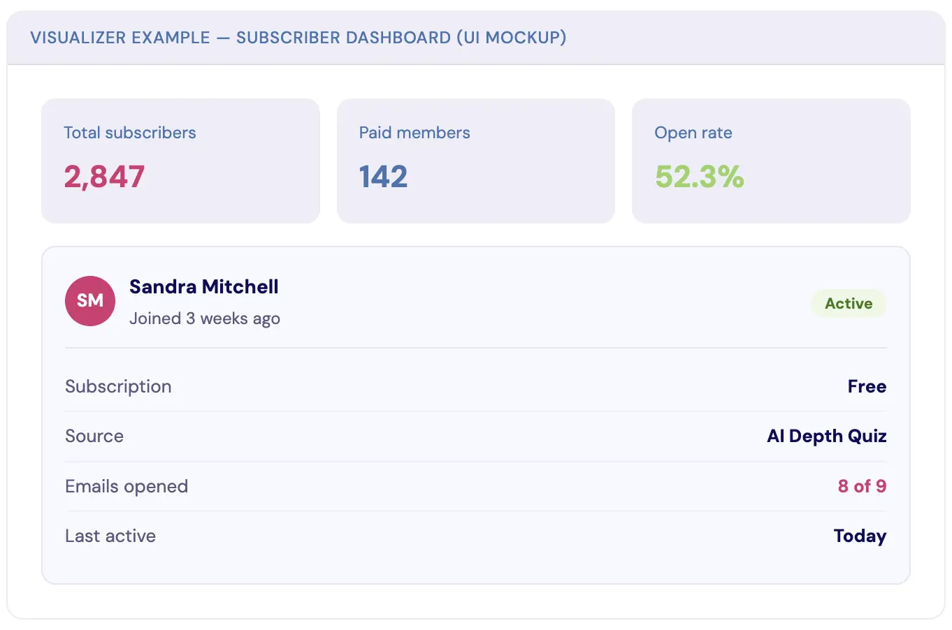
UI Mockups
Wireframes, dashboard layouts, card designs, form concepts. Before you build (or hire someone to build) a page, you can see what it might look like. Here's a quick subscriber dashboard mockup:
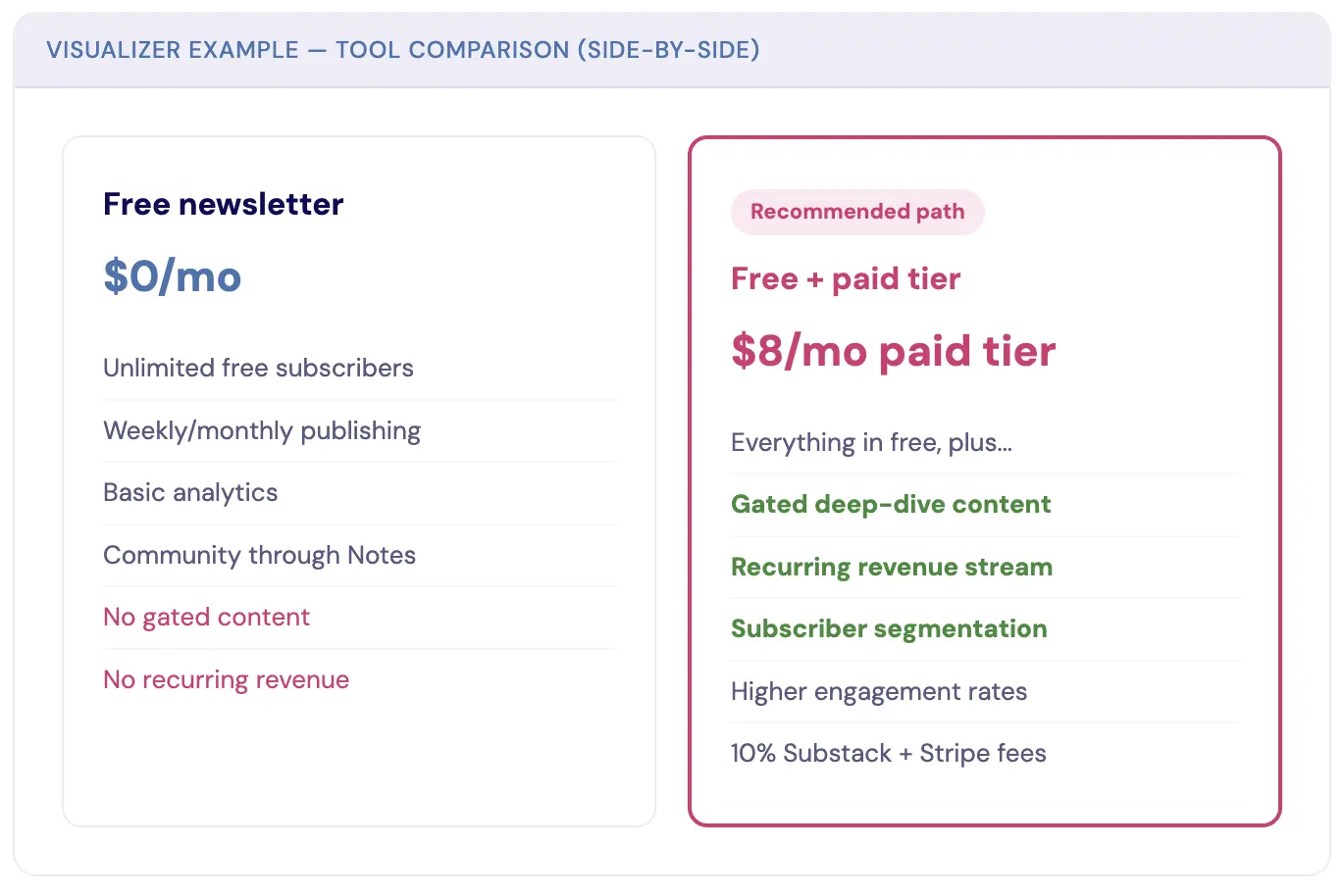
Comparison Layouts
Side-by-side feature grids, before-and-after breakdowns, and option evaluations. If you've ever needed to decide between two strategies and you're staring at a wall of pros-and-cons text... this is your answer:
Timelines, Architecture Maps, and Explainers
Visualizer also builds timelines and roadmaps for project planning, launch sequences, and content calendars... the kind where you can see the density of what's coming at a glance and catch yourself scheduling three launches in the same week before it's too late.
Architecture maps are gold if you're building anything with AI, automations, or integrations, because you can map how your entire tech stack connects, which tools feed into which, and where your data lives and moves.
And educational explainers let you break down concepts step by step, using spatial relationships that show how pieces connect... if you're teaching something to your audience (or even just yourself), seeing the components and their relationships makes everything click faster than a linear explanation ever could. All of these work the same way: describe what you want in plain language, and Claude builds it visually, right there in the conversation.
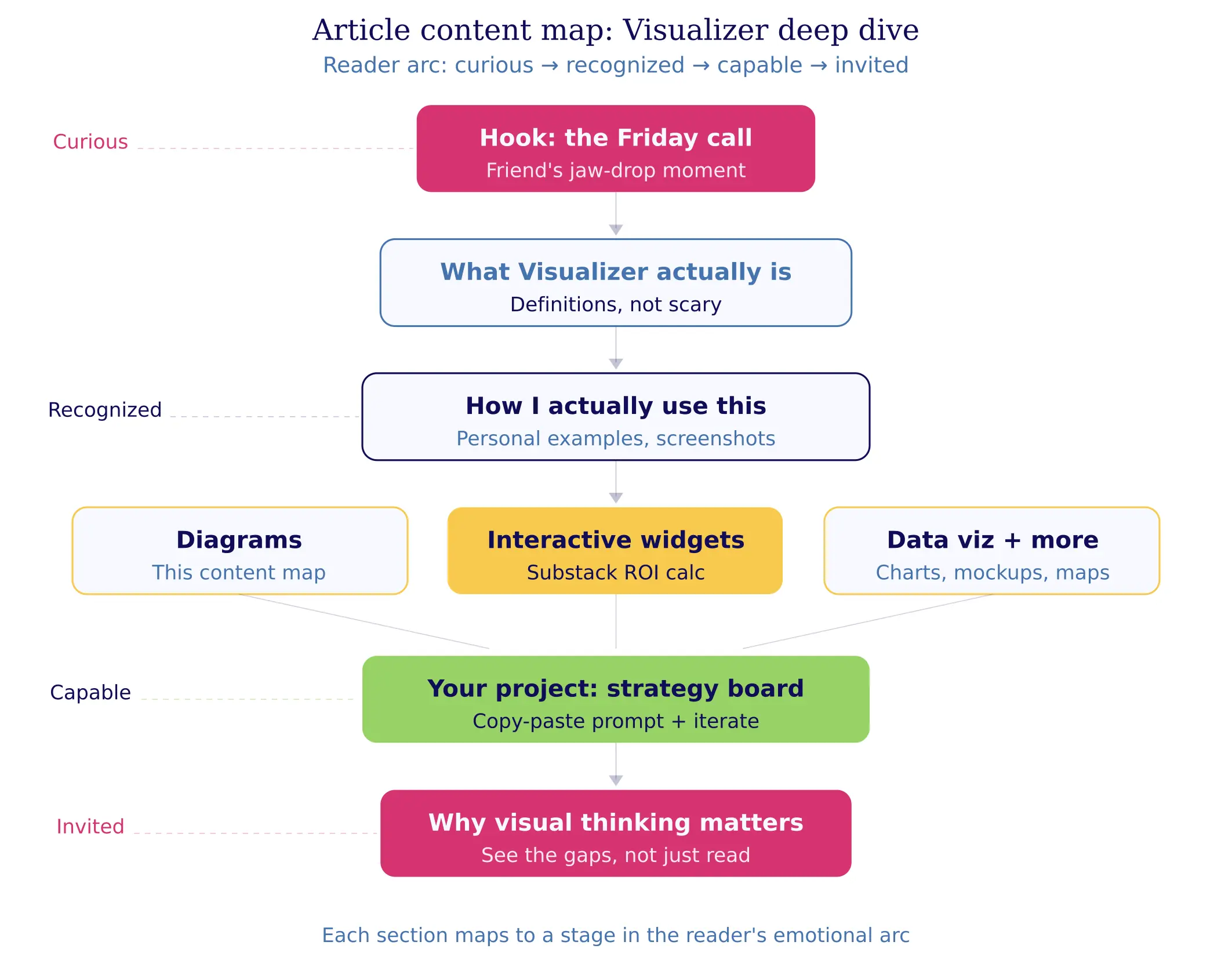
The Content Map for This Article
And because I can't help being meta about this... here's the actual content map I used to plan the article you're reading. Each section maps to a stage in the reader's emotional arc:
Your Turn: Build a Brand Strategy Board
Okay, here's your homework. And I mean that... I actually want you to do this, not just read about it and think "that's cool" and close the tab.
You're going to ask Claude to build you a Brand Strategy Board. One visual artifact that maps out your brand's core components and shows you the relationships between them in a way that no Google Doc or Notion page can match.
Here's the prompt to get you started (copy this, paste it into Claude, and customize the brackets):
"I want to build a visual Brand Strategy Board. Create an interactive visual layout that maps these elements of my brand:
Core Identity: [your one-line brand statement]
Who I Serve: [your audience in one sentence]
Primary Offer: [your main product or service]
Content Channels: [where you publish — newsletter, YouTube, blog, etc.]
Lead Magnet / Entry Point: [how people first find you]
Revenue Streams: [how you make money]
Show the connections between these elements. Use a clean, professional design with a clear visual hierarchy. Make it interactive so I can click to expand sections."
That's your starting point.
But here's what makes this powerful... you're not done after the first version.
Iteration round 1: Look at it. What's missing? Tell Claude. "Add my email sequences between the lead magnet and the primary offer" or "Show the feedback loop from content to community."
Iteration round 2: Go deeper on one section. "Expand the Content Channels section to show what type of content goes on each platform and how often."
Iteration round 3: Make it yours. "Change the colors to match my brand," or "Add icons for each section," or "Make the whole thing horizontal instead of vertical."
This is the part people miss. It's not about getting a perfect output on the first try. It's about the conversation, the back-and-forth where you see something, react to it, and refine it. Three rounds in, you've got something that would have taken a designer hours... and you understand your own brand better because you built it yourself.
Why "Show Me" Changes What You Can Think
There's a reason I keep coming back to Visualizer for strategic work instead of just asking Claude to write me a plan.
When you see your business laid out visually, gaps become obvious. Connections you assumed existed... don't. Opportunities you hadn't considered are suddenly right there in front of you. It's the difference between reading a map description and actually looking at the map.
I've rebuilt entire sections of my business strategy because a Visualizer output showed me something a text-based plan never would have. Not because the information was different (the information was exactly the same), but because the format changed what I could perceive. Our brains process spatial relationships differently than linear text, and once you start working that way with AI, you don't go back.
So go build your Brand Strategy Board. Screenshot it and share it. And then start asking yourself: what else could I see instead of read?
I'd love to know what you build. Show me what comes out of your first Visualizer session... I promise it'll be better than you expect. 😉
Kim Doyal
Kim Doyal is a digital marketing strategist and AI builder with 18 years of online business experience. She is the founder of AI Spark Studios and SPARK Lab, and the creator of The Hub — a custom 33-agent AI operating system that runs her entire business. She has also built kimdoyal.com, StackRewards, and multiple AI tools and agents using vibe coding, a natural language approach to building software without a traditional development background.
Keep Reading
Business Growth
AI Architecture Week: The Four Rooms Every AI Business Needs
I came into this week already tired. The kind of tired that's about the quantity of moving pieces, not any one thing. So instead of pushing through, I took an architecture week — five days of mapping my business instead of producing in it. Here's the four-pillar framework I landed on, and the audit prompts you can use to check your own.
April 24, 2026READ MORE
Vibe Coding
How I Built a Custom AI App in 3 Hours (A Vibe Coding Case Study)
If you've been following my journey into "vibe coding," you know I'm always on the lookout for tools that make bringing ideas to life faster and more intuitive. While I've had success with other platforms, a new tool recently caught my eye and has completely changed the game for me.
August 28, 2025READ MORE
AI Building
How I Built an AI-Powered Quiz Generator App With No Code (Case Study)
I've always believed that the best business ideas come from solving a problem you have personally experienced. That's exactly how my new app, TypeQuiz, was born.
August 5, 2025READ MORE